blog2
hi, this is my second blog, which is about the swiss. :D
In the previous blog, I briefly introduced COVID. This blog is about Switzerland. The first part is why it is recommended to travel to Switzerland, and the second part is to analyze the epidemic situation in Switzerland.
part 1
Which country should I go to during the epidemic?
I’ve briefly introduced covid19 in the previous blog. This blog is about Switzerland. The first part is why I recommend traveling to Switzerland. The second part is to analyze the epidemic situation in Switzerland.
As shown in this figure1, you can clearly see the impact of the virus in the world. I set the map to blue to better distinguish. The more severe the epidemic, the darker the color of their dots. Conversely, the less severe the epidemic, the lighter the dots. I believe that such an improvement can intuitively observe the distribution of the epidemic. It can be seen that the United States, Africa, Russia, and Southeast Asia are all areas with severe epidemics.
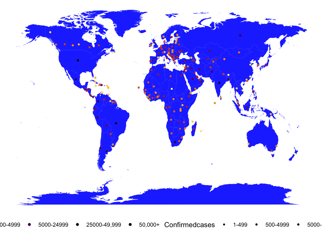
Figure 1: the world map of covid19
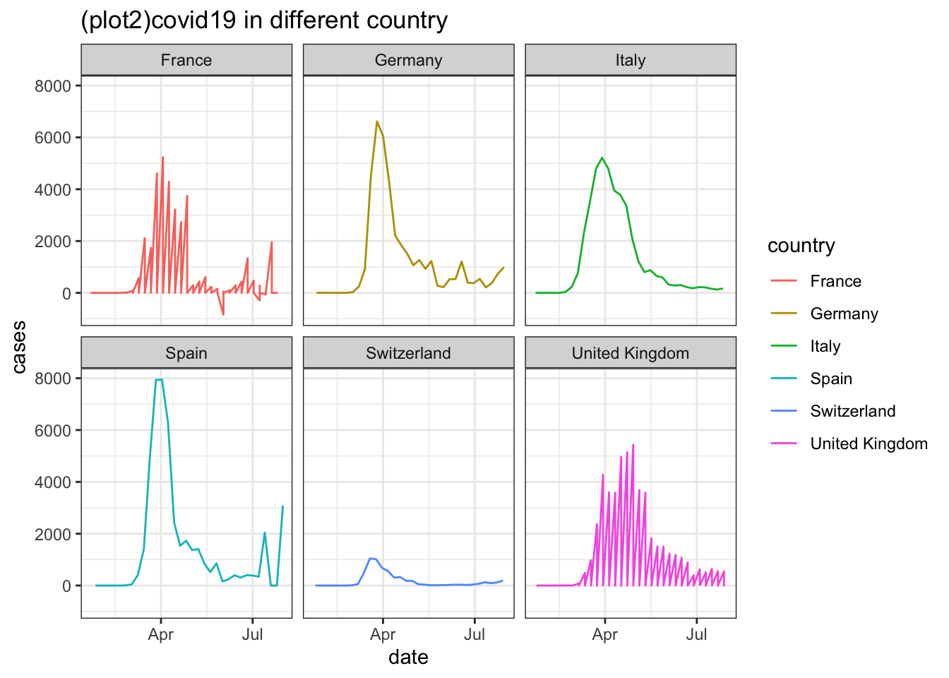
Figure 2: covid19 in different country
I believe that after months of blockade, everyone is eager to travel (the choice to recommend to Europeans, because Europeans can travel freely in Europe without a visa, and it may not be very convenient if you are not Europeans). For your good health, I highly recommend you to travel to Switzerland.
According to the survey, the most popular countries in Europe are the United Kingdom, France, Spain, Switzerland, Germany, and Italy. As shown in the figure2, I show the epidemic maps of each of the six countries. This is an intuitive demonstration of the epidemic situation in the six countries, in detail (dividing six countries into four top-levels, the first level - no travel, the second level - high danger, the third level - moderate danger, the fourth level - low danger). Level one: Italy is the most serious country. Although his one-day case is not the highest, it has continued to grow for the longest time. The second level is that Spain and Germany are countries with more serious epidemics. Their one-day confirmed cases are very high, but their high growth duration is not long. The third level is Britain and France, which do not grow very fast in a single day and last for no longer in Italy. The fourth and safest country is Switzerland, which not only grows very low a day, but also lasts for a short time (3.15-4.15).
So from the point of view, Switzerland is a relatively safe country in Europe. You can go there at ease, but pay attention to your own protective measures
part 2
analyze the epidemic situation in Switzerland.
The next report is to analyze the current epidemic situation in Switzerland. The content is divided into 4 pictures to give you an intuitive understanding of the current epidemic situation in Switzerland.
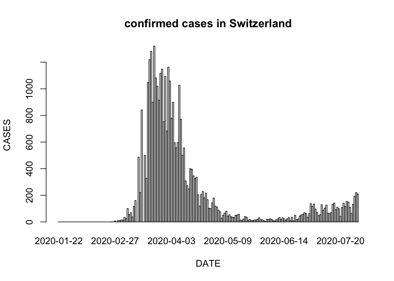
Figure 3: confirmed cases in Switzerland
First of all, the first figure3, we saw was the daily number of confirmed diagnoses in Switzerland during the epidemic. Here, the barplot has been specially selected to observe the peaks, troughs and trends of the epidemic more intuitively. In this picture, we can see that the peak of the epidemic in Switzerland is between March and April, and the number of confirmed cases can reach more than 1,000 people.
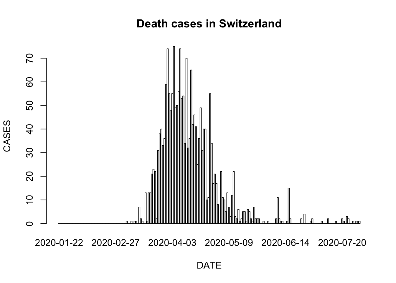
Figure 4: Death cases in Switzerland
The second figure4describes the daily number of deaths in Switzerland during the epidemic. The difference from the previous figure is that the deaths are mainly concentrated between April and May, and the death toll can reach up to 70 people per day.
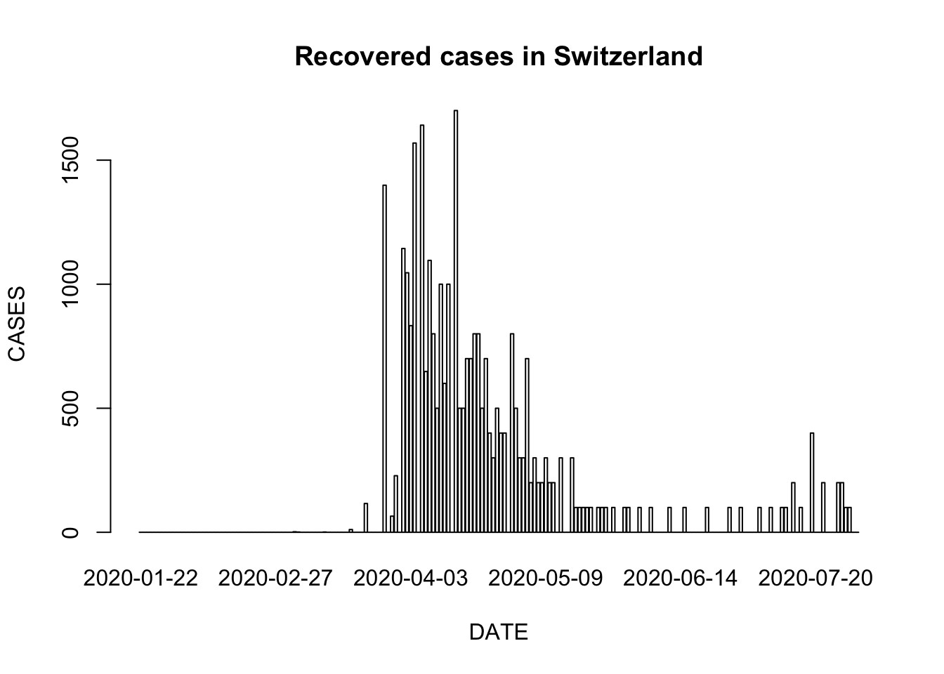
Figure 5: Recovered cases in Switzerland
The third figure5describes the daily number of recovered in Switzerland during the epidemic. The same trend as the previous one is that recovered is also mainly concentrated between April and May, and the maximum number of rehabilitation can reach 1,500 people per day.
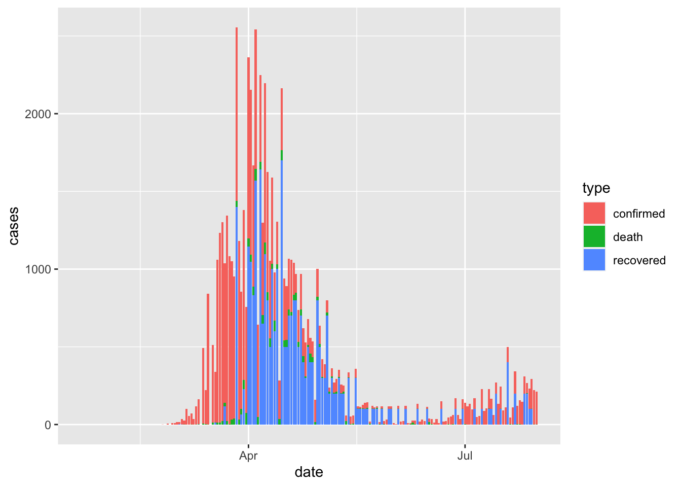
Figure 6: covid19 barchart in Swiss
The last figure6is a figure that combines recovered, confirmed, and deaths, which more intuitively shows the ratio of the number of people who have recovered, confirmed, and death since the epidemic. As shown in this figure, the peak period for the diagnosis of the epidemic is from March to April, and the peak period for recovery is from April to May. At the same time, we can also find that the proportion of deaths is only a small part of them.
Acknowledge
(tidyverse){Hadley Wickham and Mara Averick and Jennifer Bryan and Winston Chang and Lucy D’Agostino McGowan and Romain François and Garrett Grolemund and Alex Hayes and Lionel Henry and Jim Hester and Max Kuhn and Thomas Lin Pedersen and Evan Miller and Stephan Milton Bache and Kirill Müller and Jeroen Ooms and David Robinson and Dana Paige Seidel and Vitalie Spinu and Kohske Takahashi and Davis Vaughan and Claus Wilke and Kara Woo and Hiroaki Yutani}
(ggplot2){Hadley Wickham}
(mapdata){Original S code by Richard A. Becker and Allan R. Wilks. R version by Ray Brownrigg.}
(coronavirus){Rami Krispin and Jarrett Byrnes}
(dplyr){Hadley Wickham and Romain François and Lionel { Henry} and Kirill Müller} # Bibliography ## 1 author = {JHU CSSE}, title = Johns Hopkins University Center for SystemsScience and Engineering , publisher = {JHU CSSE}, year = {2019}, url = {https://link.zhihu.com/?target=https%3A//systems.jhu.edu},
2
@Manual{, title = {coronavirus: The 2019 Novel Coronavirus COVID-19 (2019-nCoV) Dataset}, author = {Rami Krispin and Jarrett Byrnes}, year = {2020}, note = {R package version 0.3.0}, url = {https://CRAN.R-project.org/package=coronavirus}, publications = Rami Krispin and Jarrett Byrnes (2020). coronavirus: The 2019 Novel Coronavirus COVID-19 (2019-nCoV) Dataset. R package version 0.3.0. }
3
Wickham et al., (2019). Welcome to the tidyverse. Journal of Open Source Software, 4(43), 1686, https://doi.org/10.21105/joss.01686 @Article{, title = {Welcome to the {tidyverse}}, author = {Hadley Wickham and Mara Averick and Jennifer Bryan and Winston Chang and Lucy D’Agostino McGowan and Romain François and Garrett Grolemund and Alex Hayes and Lionel Henry and Jim Hester and Max Kuhn and Thomas Lin Pedersen and Evan Miller and Stephan Milton Bache and Kirill Müller and Jeroen Ooms and David Robinson and Dana Paige Seidel and Vitalie Spinu and Kohske Takahashi and Davis Vaughan and Claus Wilke and Kara Woo and Hiroaki Yutani}, year = {2019}, journal = {Journal of Open Source Software}, volume = {4}, number = {43}, pages = {1686}, doi = {10.21105/joss.01686}, }
4
H. Wickham. ggplot2: Elegant Graphics for Data Analysis. Springer-Verlag New York, 2016. @Book{, author = {Hadley Wickham}, title = {ggplot2: Elegant Graphics for Data Analysis}, publisher = {Springer-Verlag New York}, year = {2016}, isbn = {978-3-319-24277-4}, url = {https://ggplot2.tidyverse.org}, }
5
Original S code by Richard A. Becker and Allan R. Wilks. R version by Ray Brownrigg. (2018). mapdata: Extra Map Databases. R package version 2.3.0. https://CRAN.R-project.org/package=mapdata @Manual{, title = {mapdata: Extra Map Databases}, author = {Original S code by Richard A. Becker and Allan R. Wilks. R version by Ray Brownrigg.}, year = {2018}, note = {R package version 2.3.0}, url = {https://CRAN.R-project.org/package=mapdata}, }
6
Hadley Wickham, Romain François, Lionel Henry and Kirill Müller (2020). dplyr: A Grammar of Data Manipulation. R package version 1.0.2. https://CRAN.R-project.org/package=dplyr @Manual{, title = {dplyr: A Grammar of Data Manipulation}, author = {Hadley Wickham and Romain François and Lionel { Henry} and Kirill Müller}, year = {2020}, note = {R package version 1.0.2}, url = {https://CRAN.R-project.org/package=dplyr}, }